On this page
Holiday lights can make the same house feel cozy, crisp, or playfully festive. The easiest way to choose a color is not to start with a trend; start with the mood you want, the surfaces the lights will sit beside, and the lighting already on your home.
There is no one right answer for every façade. Use the comparisons below to narrow the field, then judge a real sample in your own setting before planning the full display.
What each color direction says
Warm white: soft and traditional
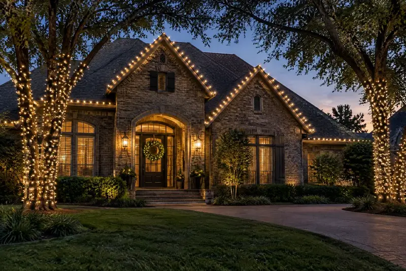
Warm white tends to read as a softer, more golden white. It can complement a relaxed, traditional scheme, especially when paired with evergreen wreaths, natural-looking garland, or restrained red accents. Along a roofline or around a front entry, it can give the display a gentle, unified feel without introducing another strong color.
It is a natural starting point if your existing porch lanterns already look warm. But do not assume every product described as “warm white” will look identical: labels, appearance, and available settings differ by product. Check the packaging and compare the actual lights you intend to use.
Cool white: crisp and high-contrast
Cool white tends to look cleaner or bluer beside a warm-toned white. It can suit a more contemporary, pared-back display or make a simple outline feel sharp and graphic. Try it with a limited number of shapes—perhaps a roofline and one doorway feature—rather than adding more colors automatically.
The contrast can be striking, but it may also stand apart from a warm porch lamp or nearby indoor glow visible through windows. If those existing lights are part of the view, include them when you evaluate the sample.
Multicolor: lively and expressive
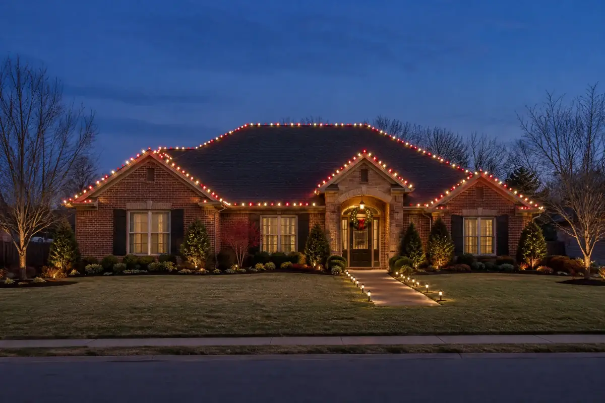
Multicolor lights bring several hues into the display at once, so they can make a small, deliberate focal area feel cheerful. A single tree, an entry feature, or one defined section can carry the color while the rest of the house stays visually quiet. That contrast helps the colors feel intentional instead of competing with every other decoration.
Before choosing, look at the actual colors and sequence in the set. “Multicolor” is not one standardized palette. If you already have older strings, compare them in person: colors that seem similar in a box or on a screen may not look consistent when installed beside one another.
Match the lights to the house—not just the box
Make a quick palette check from the sidewalk. Note the dominant exterior material, trim color, roofline, front door, and any permanent porch or landscape lighting. Brick and stone have complex tones; siding and trim may read differently under evening light. These are visual considerations, not fixed rules: a test is more useful than a label alone.
Then choose one of three approaches:
- Blend: Pick one white direction that feels at home with the existing exterior lights and repeat it across the main outline.
- Contrast: Use a distinctly different color temperature or multicolor accent in one focal zone, while keeping neighboring areas simple.
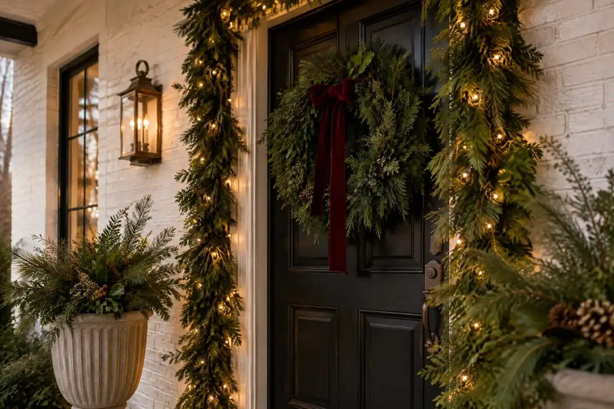
- Coordinate: Let a wreath, ribbon, or other seasonal accent supply color and keep the string lights a single white tone.
If you are unsure, take a ground-level photo of the front of the house and mark the areas you might light. A photo can help you notice when a second color adds balance—or when it creates another competing focal point. Treat the photo as a planning aid, not a substitute for seeing the lights in place.
A simple sample test before you commit
- Check what you own. Gather a few lights you might reuse and read their labels. Separate products with different descriptions or settings rather than assuming they will match.
- Test in context. Place a small sample where it can be viewed safely from the ground, beside the trim or material it will illuminate. Do not climb or improvise a mounting method to stage the test.
- Look at dusk and after dark. The changing ambient light can alter how the color reads. View it from the sidewalk and from the usual approach to your entrance.
- Compare the whole palette. Turn on the existing exterior fixtures you normally use. Notice whether the holiday color coordinates, contrasts pleasantly, or seems mismatched.
- Choose a lead color and a limit. Decide which look carries the display and where any accent stops. Record the product details so additions can be checked against the same choice.
This small rehearsal can prevent a common disappointment: buying or installing a large quantity before realizing that two “white” strings look different beside each other. ENERGY STAR explains that Kelvin color temperature describes whether a light appears warmer/yellower or cooler/bluer, and encourages checking the package’s lighting information. That is useful background for comparing products, but do not treat a general color label as a promise that different strings will match.
Keep the plan safe and simple
Color choice does not change the basics of outdoor use. CPSC advises checking that lights used outdoors are certified for outdoor use and inspecting sets for damaged sockets, frayed or bare wires, and loose connections; damaged sets should be discarded. Follow the specific product instructions and ratings, rather than relying on a generic string-count rule. If equipment is damaged, wet inside, hot, smells burnt, or causes repeated protective-device trips, stop using it and seek qualified help.
For a cohesive home display, begin with the color you want people to notice first, then let the house’s materials and existing lights guide the supporting choices. Explore our residential Christmas light installation service if you would like help planning an exterior scheme, or request a quote when you are ready to discuss your project.
Sources
Explore Residential Christmas Light Installation.
See the service overview, then tell us what you are considering for your property.